Filter
Use cases


Setting up a filter
First, define your filter groups in an array. An array is a list!
// In this example, we define 4 filter groups in an array and store it in a variable called myFilters
var myFilters = [
{
filterWrapper: ".filter-bar-category", // parent wrapper of filter group1
filterType: "exclusive"
},
{
filterWrapper: ".filter-bar-color", // parent wrapper of filter group2
filterType: "multi",
filterByClass: ".color" // class of the text that holds the filter info (optional)
},
{
filterWrapper: ".filter-bar-price", // parent wrapper of filter group3
filterType: "multi",
filterRange: true // filter by number range (optional)
},
{
filterWrapper: ".filter-bar-service", // parent wrapper of filter group4
filterType: "multi"
}
]
</script>
Then run the function below the array!
<script src="https://cdn.jsdelivr.net/npm/@finsweet/cms-library@1/cms-library.js"></script>
<script>
// immediately/self invoked function. This function executes right away
(function() {
// create a new Library instance and store it in a variable called "customBlogPosts"
var customBlogPosts = new FsLibrary('.blog-posts-list')
// define 4 filter groups in an array and store it in a variable called myFilters
var myFilters = [
{
filterWrapper: ".filter-bar-category", // parent wrapper of filter group1
filterType: "exclusive"
},
{
filterWrapper: ".filter-bar-color", // parent wrapper of filter group2
filterType: "multi",
filterByClass: ".color" // class of the text that holds the filter info (optional)
},
{
filterWrapper: ".filter-bar-price", // parent wrapper of filter group3
filterType: "multi",
filterRange: true // filter by number range (optional)
},
{
filterWrapper: ".filter-bar-service", // parent wrapper of filter group4
filterType: "multi"
}
]
// run the filter Library component on your instance
customBlogPosts.filter({
filterArray: myFilters, // variable of the array we created above
activeClass: 'button-active', // class that styles the active state (optional)
emptyMessage: '.empty-message',
animation: {
enable: false,
}
})
})();
</script>
Paste this block of code before </body> tag of the page you're working with.
Code explanation
The variable we created to store our Library instance. The name of the variable can be set to whatever you want.
A variable we established to store our array. This is variable holds all of our filter groups establishes how the filter groups work. You can name this variable anything you want.
The parent div wrapper holding the ui elements of a filter group.
Can be exclusive or multi select specific to that filter group.
Allows the user to select 1 option inside the group at a time. The filter is exclusive to 1 option so for example clicking "red" would select all items with "red". If you then clicked "blue", "red" would be unselected.
Allows the user to select multiple options inside the group at a time so that clicking "red" would select items with "red". If you then clicked "blue", "red" would remain selected. Both options will be selected at the same time. The filtered grid would show results that match both "red" and "blue".
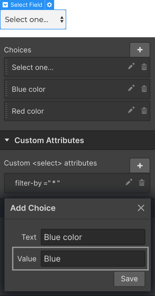
Optional. Used for making your filter buttons more specific. Limit your filter group to a single field in your CMS collection.
This is useful when keywords from other CMS Collection fields conflict. For example, "Kentucky USA" and "Kentucky Fried Chicken"
Add filterByClass to your filter array:
filterWrapper: ".states-filter",
filterType: "multi",
filterByClass: ".states-text"
~.states-text~ is the class of the CMS field you want to limit your filter to.
Tutorial for filterByClass: https://cmsdocs-howto.webflow.io/filter/example9
Optional. Used for filtering number values inside your Collection. Set to ~true~ to use this filter group to filter a range of numbers. This allows you to add number value ranges to your filter buttons.
Add filterRange to your filter array:
filterWrapper: ".price-filter",
filterType: "multi",
filterRange: true
Next, use a number range as your value inside your ~filter-by~ data attribute applied to your filter button. Works with prices!
For example,
~filter-by: "20-66"~
Tutorial for filterByRange: https://cmsdocs-howto.webflow.io/filter/example8
Our variable that holds the array we created. This array is a list that holds all of our filter groups.
In the example, our filterArray value would be would be ~myFilters~.
The class that will be added to buttons when they are in an active state. This allows you to visibly show the user that a filter is active.
IMPORTANT: You must create a style for this active class inside Webflow. If you set your active state to the class 'button-active' you must create a style in Webflow Designer for button-active.
~activeClass: 'button-active'~
Optional. Creates a button that resets all filters.
The class applied to a button that resets all active filters.
~filterReset: '.filter-reset-master'~
Tutorial for filterReset: https://cmsdocs-howto.webflow.io/filter/example7b
Shows a div when filter has 0 results.
~".empty-message"~ is a class applied to a div. When there are no items to show when filtering, this div will be set to ~display: block~.
~emptyMessage: '.empty-message'~
Please use the class ~'.empty-message'~
Option to add animations and transitions for items leaving and entering the filtered grid.
~true~ turns on animation on, ~false~ turns animation off (default: ~true~).
Time the animation happens in seconds. ~0.2~ would be 0.2 seconds, or 200 milliseconds (default: ~0.2~).
Easing of the effect. Available options are ~ease~, ~ease-in~, ~ease-out~, and ~ease-in-out~ (default: ~ease~).
Add ~fade~, ~translate~, ~rotate~, and ~scale~ effects (default: ~fade~).
HTML structure and data-attributes

HTML Structure
Here we have created 3 filter groups: ~.filter-bar-category,~ ~.filter-bar-color~, and ~.filter-bar-service~. These are the class names we put as the value of the filterWrapper option when we create our array. The UI elements that control the filtering of that group are children.
Filter buttons can be deep nested inside the parent wrapper. They don't have to be direct children. Check out the Checkbox nested-nested-nested inside ~.filter-bar-service~.
We got you for full flexibility!
Attributes

The attribute placed on your filter button.
This tells the Library what to filter by when that ui element is clicked.
Each ui element you want to use as a button inside your filter ui needs a attribute with a name of filter-by. The value of the filter-by attribute is the keyword that ui element should filter by. For example, if you wanted to search for CMS items that have "Website Designer", you would make the filter-by value "Website Designer".
A value of "*" will filter ALL items in that group (can be used to remove/reset the filter).
Confused about how this works? Watch our How To walkthrough to see this working visually.
Types of html elements we can use to filter