Intro
Intro to Client-First with an overview of the essential principles.
Client-First overview
👉 This is a short overview to understand the core parts of Client-First. Read the full documentation for the complete learning experience.
New to Webflow? Before learning Client-First, we recommend learning the basics of Webflow. Client-First does not teach HTML or CSS. It's important to have a beginner-level understanding of these topics before learning Client-first. Read our Beginners in Webflow.
Goals of Client-First
- To create an organization system for our project
- To enable speed and flexibility when using Webflow Designer
- To define a strategy for class usage in the project
- To standardize a core structure shared across all pages
- To create a Webflow build that is scalable and easily manageable
- To help developers, clients, or anyone understand the project
What does "Client-First" mean?
Client-First = We put our clients' interests first in the Webflow build process.
By making our clients our top priority, we have created a style system that satisfies their needs and makes us better Webflow developers.
Most clients want us to
- Create a scalable Webflow project
- Create a project quickly, without losing quality
- Create a project that many people within our agency can manage
- Create a project that we can hand off to a different Webflow developer/agency if the client decides to change vendors
- Create a project that a client can manage inside Designer*
* Not all clients want to manage their Webflow project. Some do, and most don't.
Creating a project that allows for scalability and flexible post-launch management significantly benefits any client company using Webflow.
Our decisions in Client-First help us build more efficiently as Webflow developers, as well as help deliver a top-value project to our clients.
Naming convention
Client-First has a focus on clear class naming throughout the project.
A Webflow developer, client, or any person should be able to understand what a class is doing based on a class name, even if that person has no experience with Client-First.
Goals of Client-First naming convention:
- Empower a non-technical person to manage our website.
- Be clear, informative, and descriptive in our class naming.
- Give the reader as much context into the purpose of the class.
- Read a class name and know what its purpose is.
- No abbreviations, no shorthand, no confusion.
- Give as much context into the relationship of that class with the website.
- Create names based on prefix and keyword organization techniques.
- Visualize the purpose of a class based on its name.
Overview topics
This Intro page reviews the essential topics of Client-First. These are not all of the principles of Client-First.
The goal of this page is to review the most important topics. Read this page if you are considering Client-First as your Webflow style system.
Webflow focused strategies
- Classes strategy
- Core structure strategy
- Typography strategy
- Spacing strategy
- Folders strategy
Disclaimer: This is not following every best practice of traditional HTML and CSS build conventions. This is not traditional, this is Webflow. Webflow has redefined how HTML and CSS can be managed visually in our projects. Client-First is built specifically for Webflow Designer workflow and organization.
[fs-toc-h3]Classes strategy
We organize classes by "custom class" and "utility class". We define these two classes by the _ character.
Custom classes have _ in the class name
header-primary_content
Utility classes don’t have _ in the class name
text-color-primary
[fs-toc-omit]Custom class
Usually for something specific and visual on the page
A custom class is created for a specific component, page, grouping of elements, or single element. For example, a class to style the team slider or a class to style the global headers for the project. Custom classes use an underscore in the class name.
Examples:
- about-team_component
- footer_column
- clients-slider_arrow
- nav_link
- home-header_texture
Form component example using form_[element-name]
- form_component
- form_wrapper
- form_block
- form_label
- form_input
- form_submit
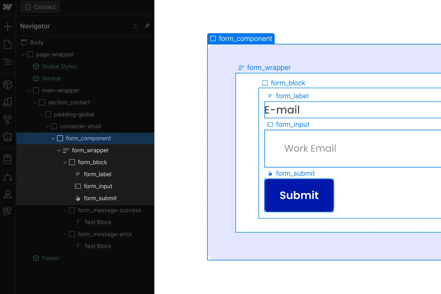
Each of these examples refers to a specific identifiable element.
[fs-toc-omit]Utility class
Usually for an important CSS style on the page
A utility class is created for a specific combination of CSS properties, which can be applied to elements across the project. For example, a class for background-color or a class for font-size. Utility classes will not use an underscore in the class name.
Most of the classes that come with the Client-First starter project are utility classes.
Examples:
- padding-global
- max-width-small
- margin-large
- text-color-secondary
- background-color-dark
- display-none
Each of these examples refers to specific CSS style properties.
[fs-toc-omit]Global class
A custom class or utility class that can be used throughout the site
A global class is intended for use across the entire project. A global class is not for a specific instance. It applies styles that will remain 'global' or 'unified' across the project.
Global classes can be utility or custom classes.
A utility is always a global class. Utility classes are global in nature.
A global class can also be a custom class, such as header_content. We may have a recurring header structure used throughout our project, and this class will allow us to manage the header_ styles globally.
If we intend to use the class throughout the website, it is considered global.
[fs-toc-omit]Combo class
A class that is created as a variant to a base class. A combo class inherits styles from the base class and adds more styles on top of it.
We define the "base class" as the first class in our stacked combo class. We add a class on top of the base class to create a unique variation. The class that creates the unique variation has a class prefix of is-.
The stacked is- variant class will only work when combined with the base class(es) before it. Together, the stacked classes are a combo class.
In the video below, understand that is-brand does not work alone. It only works as an addition to the base button class.
Combo classes can be created out of custom or utility classes. The example above button is-brand shows a utility class as a part of a combo class.
We learn this concept in full on the Classes strategy 1 docs page.
[fs-toc-h3]Core structure strategy
Client-First sets a default core structure to follow across all builds.
- page-wrapper
- main-wrapper
- section_[identifier]
- padding-global padding-section-[size]
- container-[size]
- page-wrapper wraps all page content.
- main-wrapper holds all of the page's "main" content. This is a best practice for web accessibility.
- section_[identifier] organizes Webflow Designer's Navigator panel.
- padding-global manages universal site-wide left and right padding of a page's content.
- padding-section-[size] manages universal site-wide top and bottom padding of sections.
- container-[size] manages max-width on the containers that wrap our content.
Using this core structure, we can manage important page-level CSS properties for our project globally. This practice defines a unified approach across all Client-First developers.
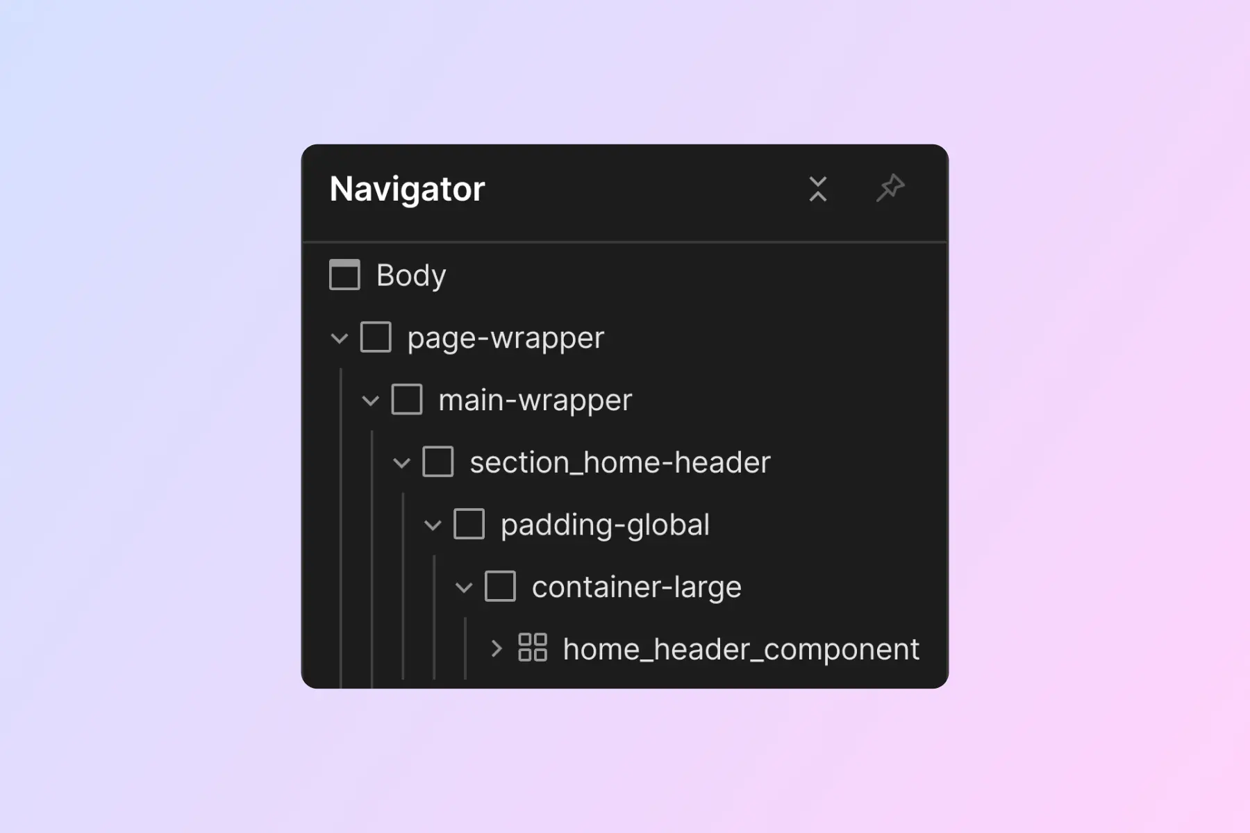
Most websites would follow the structure shown below.
[fs-toc-omit]Page structure example
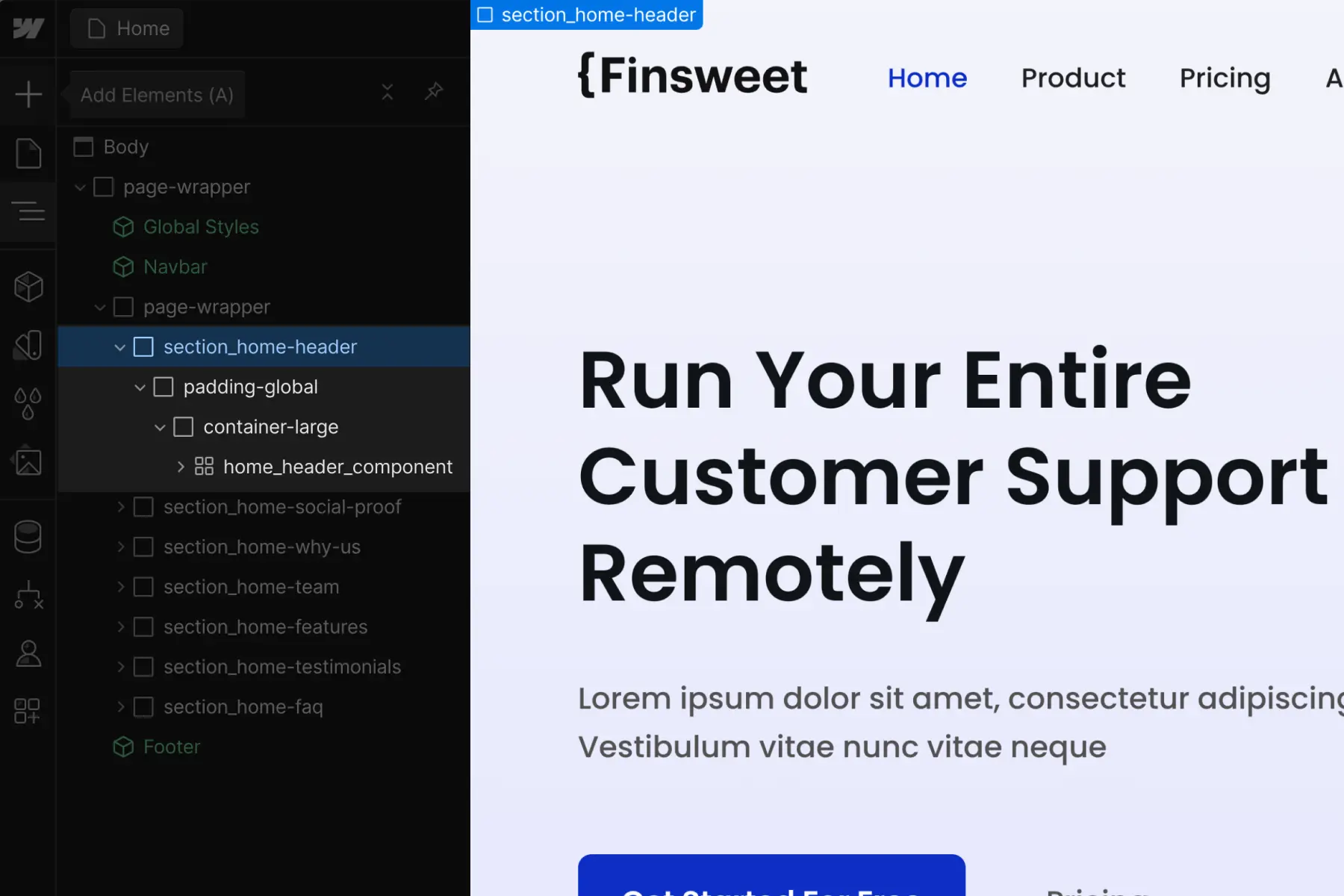
Sections are organized inside Navigator and work as anchor links when clicking through them.
[fs-toc-omit]Section structure example
Inside the core structure, we create components and visual web elements with custom classes. We use custom classes to style elements that should not be managed with utility classes.
We learn this concept in full on the Core structure strategy docs page.
[fs-toc-h3]Typography strategy
Our strategy is to keep typography as unified and globally manageable as possible. We use utility classes to manage typography.
Ideally, we don’t place any class on a text element. It’s best to inherit the default styles applied directly to the body, paragraph, and H1 - H6 HTML tags.
[fs-toc-omit]HTML tags
What are HTML tags? Webflow University resource.
Always start with styling these:
H1, H2, H3, H4, H5, H6 , body
These are the default styles for each Heading and the Body of our project.
Classes are required only when there is customization from the default.
We have a collection of utility classes included with the official Client-First cloneable. Each of these classes has a heading- or text- prefix and holds utility styles to apply to text elements. These classes apply our customizations through a unified utility system.
[fs-toc-omit]Typography classes:
- heading-style-[h#]
- text-weight-[weight]
- text-size-[size]
- text-style-[css-property]
- text-color-[identifier]
- text-align-[alignment]
For example, if we want to make an H1 Heading the same style as our H2 Heading, we can add the heading-style-h2 class on our H1. This will make the H1 styled like an H2, while maintaining the H1 tag for SEO.
For example, if we want to make any text element in the project blue in color and you have a utility class like text-color-brand linked with the blue color, we can apply text-color-brand to that text element to make it blue.
Both of these examples are a customization of the default typography styles. If there is no customization past the default H1 or Text Element, there is no need for a class.
We learn this concept in full on the Typography strategy docs page.
[fs-toc-h3]Spacing strategy
Spacing is organized into two parts:
- Utility classes
- Custom classes
Each of these has two primary strategies to implement.
[fs-toc-h4]Utility classes
The margin- and padding- classes found in Client-First utility classes.
[margin/padding direction class] + [margin/padding size class]
Inside the utility class mindset, we present 2 spacing strategies:
- Spacing block strategy
- Spacing wrapper strategy
Both blocks and wrappers are based on the same utility spacing classes.
Blocks and wrappers are different from each other based on how they are applied to the page.
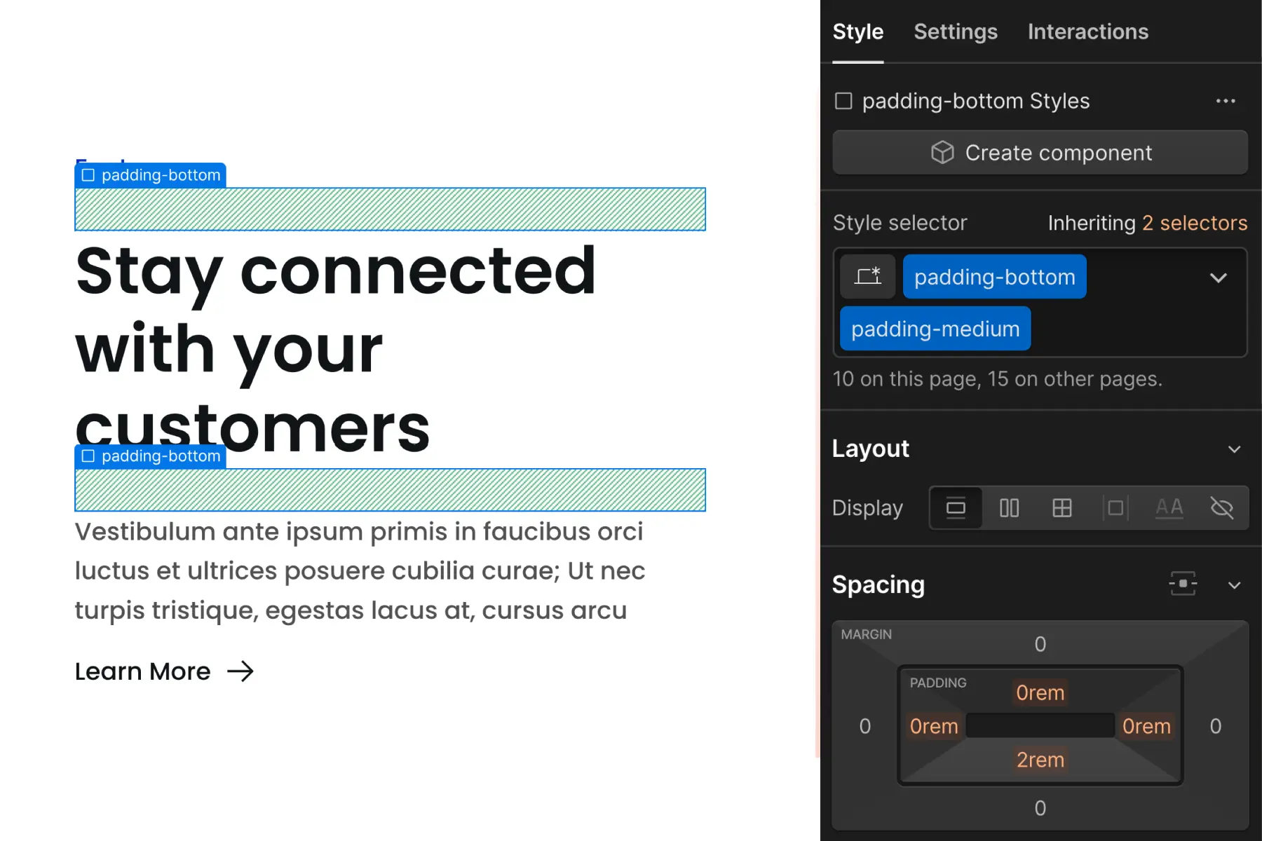
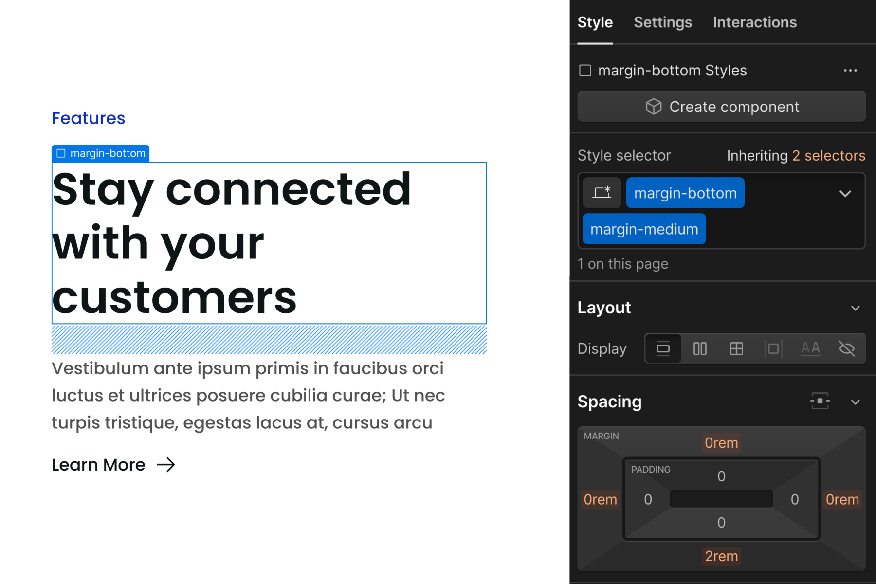
Spacing block strategy
In Client-First, a "spacing block" is an empty Div Block that creates space between two sibling elements.
1. Add a Div Block "spacing block" to the page with two classes —
[padding-bottom] + [padding-size]
2. Add content elements to the page as siblings of the spacing block.
3. The spacing block creates space (padding) between elements.
Spacing wrapper strategy
In Client-First, a "spacing wrapper" is a Div Block that wraps a child element and creates space between a sibling element.
1. Add a Div Block "spacing wrapper" to the page with two classes —
[margin/padding-direction] + [margin/padding-size]
2. Nest a content element inside the spacing wrapper.
3. The spacing wrapper creates space (margin or padding) between itself and a sibling element.
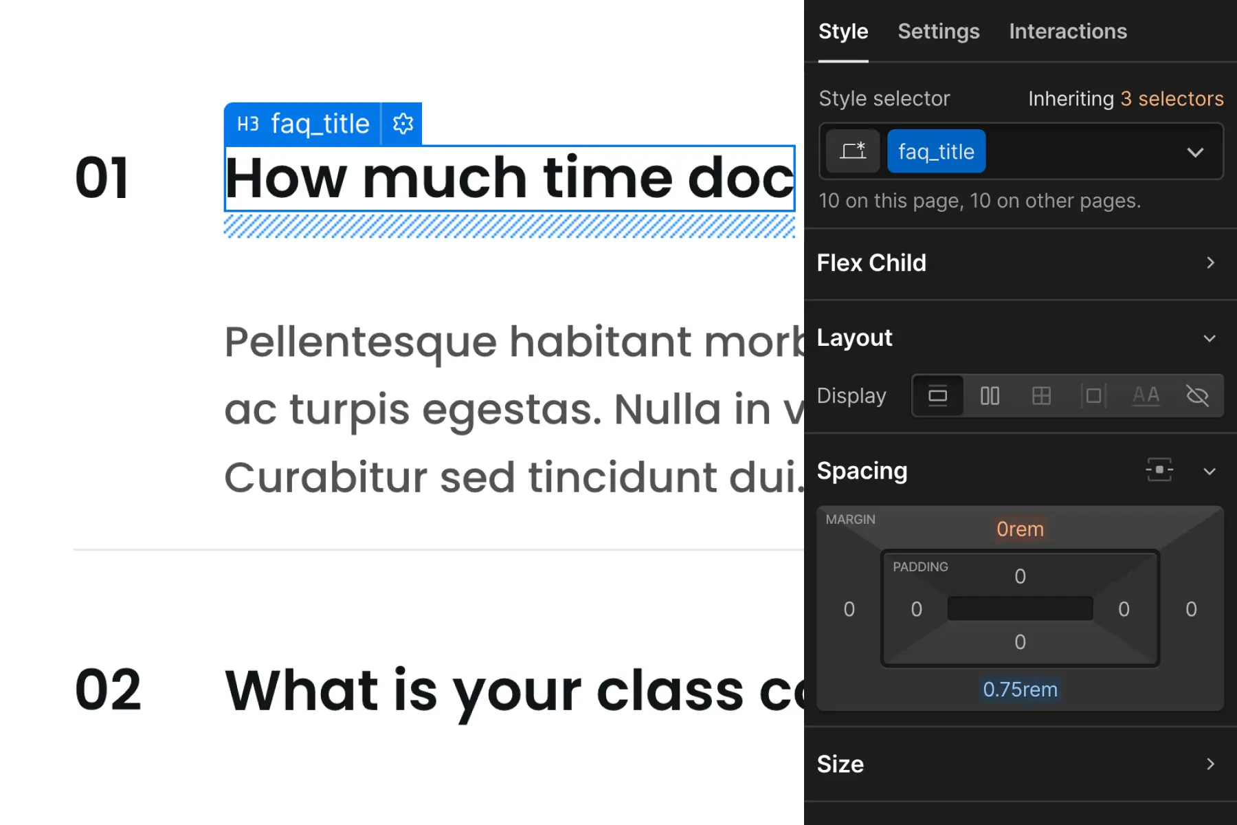
[fs-toc-h4]Custom class strategy
Custom class on element strategy
"Custom class on element" applies margin and padding values directly to the element that needs to be spaced.
For example, we apply faq_title to a Heading that requires unique spacing, which the utility class system can not achieve. A CSS property of margin-bottom: 0.75rem is applied directly to the faq_title class.
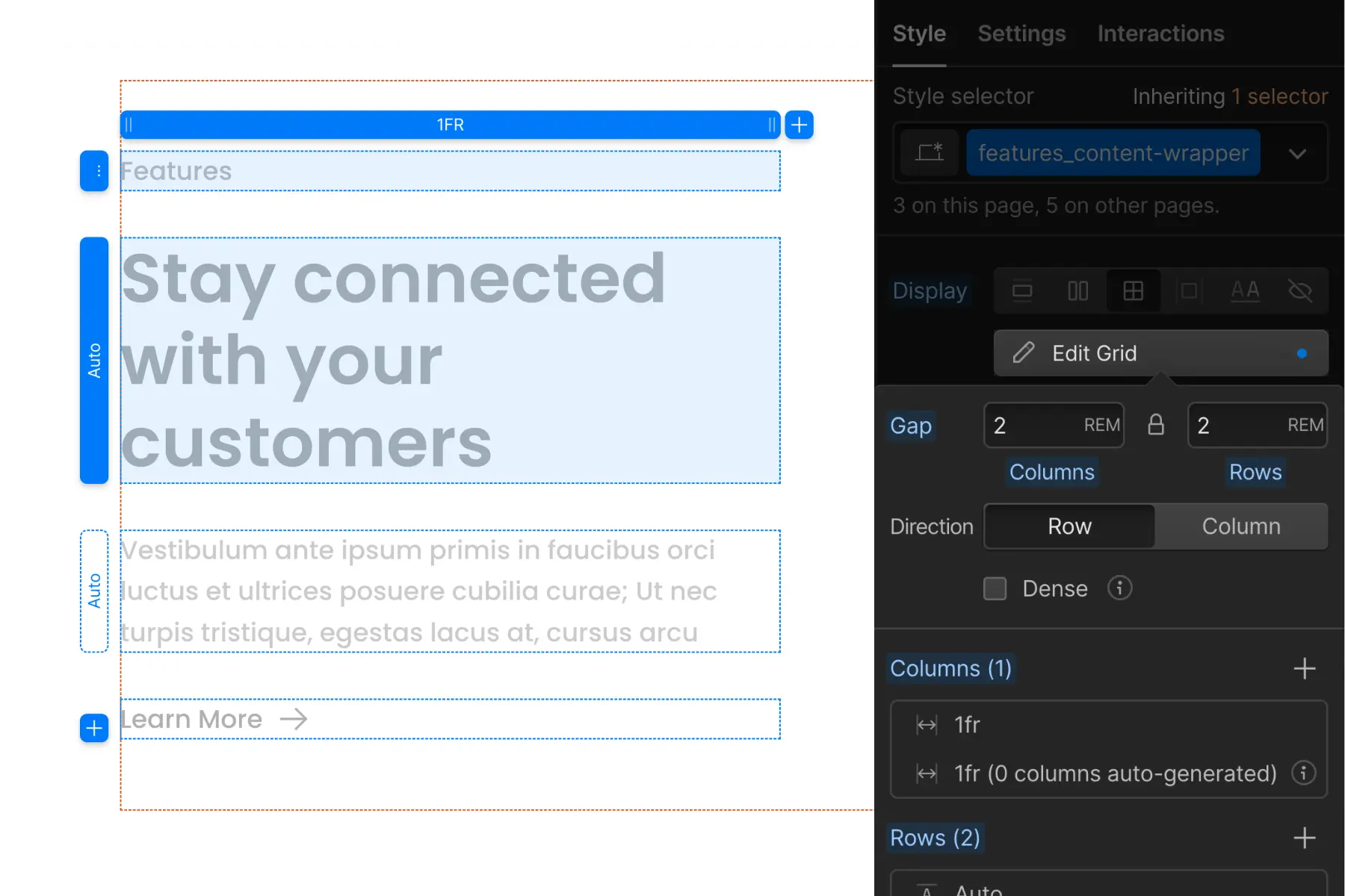
CSS Grid strategy
CSS Grid spacing strategy applies CSS Grid to a parent wrapper which creates space for the children inside it.
We can create vertical and horizontal space between child elements using CSS grid.
Instead of applying many blocks, wrappers, or custom classes on elements in a list, we can use CSS Grid strategy to manage all children with one controller — the parent wrapper.
We learn about Spacing strategy in full on the Spacing strategy docs page.
[fs-toc-h3]Folders strategy
Client-First includes a virtual Folders feature through Finsweet Extension.
The underscore character is powerful in Client-First
The underscore indicates a custom class and a folder. We can create virtual folders for our custom classes using the underscore character.
For example, blog_header_graphic represents a blog_ folder with a nested header_ folder inside with a graphic element inside it.
It looks like this in the virtual folder system:

By excluding the underscore, we are creating a utility class. Utility classes are automatically organized inside the Utility folder.
Any class without an underscore will be placed inside the Utilities folder.
Each nested folder inside the Utility folder will be generated from the first keyword of the class name.
For example, text-color-primary represents the Utility classes folder with a nested text- folder with a nested color- folder with a primary identifier inside.
It looks like this in the virtual folder system:

With the power of Folders, we can organize our project in any way. Small projects will follow a different folder strategy than large projects. Custom-built projects will follow a different folder strategy than component libraries.
Folders give us the power to customize the build strategy based on the project we are building.
We learn this concept in full on the Folders strategy docs page.
Sizes and rem
Client-First uses rem. Rem is a unit of measurement for the values we enter in Designer.
What is rem?
Rem stands for "root ephemeral unit" or "root em".
- Rem is a relative measurement based on the root element's font-size.
- The root element is <html>.
- Rem is relative to the <html> font size.
- All sizes applied in Client-First are in rem
The math
Every 16px is 1rem when the browser's font size is set to the default in browser settings. When building our Webflow project, we use 16px as our base value for calculating rem.
Every rem measurement conversion in the project is a multiple of 16.
96px / 16px = 6rem
32px / 16px = 2rem
4px / 16px = 0.25rem
Why rem?
Rem has significant accessibility benefits, and we value accessibility deeply inside Client-First.
Browser font settings and browser zoom each work flawlessly inside a rem-based system. Using Client-First in our recommended rem system will assure we are following best practices with accessibility and content scaling.