Accessibility
Follow best accessibility practices in Webflow.
This docs page is not specific to Client-First. It covers accessibility inside Webflow as a platform.
What is Accessibility?
The term accessibility (commonly referred as a11y) is not only restricted to web development, but applies to many different aspects of life.
If we take the definition of Wikipedia:
“Accessibility refers to the design of products, devices, services, or environments for people who experience disabilities.”
Applying this to our web development field, we understand it as:
“Web a11y means that anyone at any moment can use your website.”
Why is Web Accessibility so important?
Don’t fall under the widespread assumption that a11y is only needed for people with severe disabilities like blindness or reduced mobility. There are actually more types of disabilities that usually people don’t think of:
- Permanently disabled users: The user has a severe disability like blindness or deafness.
- Temporary disabled users: The user has a physical or mental disability which hinders his discharging of responsibilities for a short period of time.
- Conditional or Situational disabled users: The user is not able to do things due to the current situation he is in. Example: slow internet connection, browsing while eating...
About this guide
This guide won’t go too deep into the basics of a11y, as there is already a lot of quality content available. Check out A11y Project Checklist and Webflow’s Accessibility Checklist.
Instead, this docs page will focus on specific accessibility challenges that we experience inside Webflow as a platform.
Keyboard navigation
Due to physical restrictions, many users rely on the keyboard to navigate through our site. This section explains how we can make sure our whole site is keyboard navigation friendly.
Basic controls
Tab Key
The Tab key is used to move around the page by focusing the available elements. Every time the user hits the Tab key, the focus will move to the next focusable element. Holding Shift reverses the direction.
- It is important to make sure that all elements a regular mouse user would click on the page are also focusable with the Tab key (see Using tabindex).
- This also implies that all focusable items should have their focus state styled, otherwise the users won’t be able to distinguish what element they are currently focusing on.
Enter Key
When focusing an element, the Enter key should:
- [Finsweet solution coming soon] Activate links or buttons. Non-standard elements like divs using a role attribute need JS implemented for this.
- Send forms.
Space Key
When focusing an element, the Space key should:
- [Finsweet solution coming soon] Activate buttons.
- Activate toggle states like checkboxes or radios. This also includes buttons that toggle some functionality like an accordion.
Arrow Keys
When focusing an element, the Arrow keys should:
- [Finsweet solution coming soon] Navigate through grouped children of a component (like Tab Links, Radio buttons, Accordion Toggles, etc).
- Change the value of it (like range sliders or number inputs).
Esc Key
The Esc key should allow the user from exiting different states like:
- [Finsweet solution coming soon] Closing a modal.
Focusability
All elements that are clickable on the page should be focusable too. Standard HTML elements have this functionality built-in by default, but sometimes we need to tell the browsers to do so.
In these cases it can be achieved by adding the tabindex attribute.
The value set to it will depend on the wanted behavior:
- tabindex=”0”: Makes the element focusable with keyboard navigation, following the natural order of the page.
- tabindex=”X”: where X is any desired number greater than 0. When explicitly setting this number, we're stating the order when this element should be focused. Example: the element with tabindex=”26” will be focused after the element with tabindex=”25”.
- tabindex=”-1”: Disables the focusing of an element. This comes handy in some situations where we have a native focusable element that doesn’t provide any interactivity.
Programmatic focus
[Finsweet solution coming soon]
To improve the UX for keyboard navigation and screen readers, sometimes it’s a good idea to programmatically focus an element when a certain condition is met.
Some examples are focusing the close button right after opening a modal, or moving the focus to a certain element that appeared on the page.
However, always think of the UX! There are some cases where it’s not a good idea to automatically focus an element that appears on the page, like when switching tabs in a Tabs component.
HTML Semantics
Using <button> tags in Webflow
The main purpose of this tag is to tell the user that an element is clickable and will trigger an action on the page. This includes actions like expanding/collapsing elements (example: accordions), showing/hiding elements (example: hamburger menu or dropdown list) or custom app-like functionalities like a TO-DO item to a list.
Do not confuse <button> tags with the Button component in Webflow!
It's important to understand the difference between <button> tags and <a> tags:
- <button> activate actions on the page.
- <a> navigate through the page / website
Behind the curtains, the Webflow Button component is just a regular html anchor link (<a> tag) with some styles sprinkled on top of it:
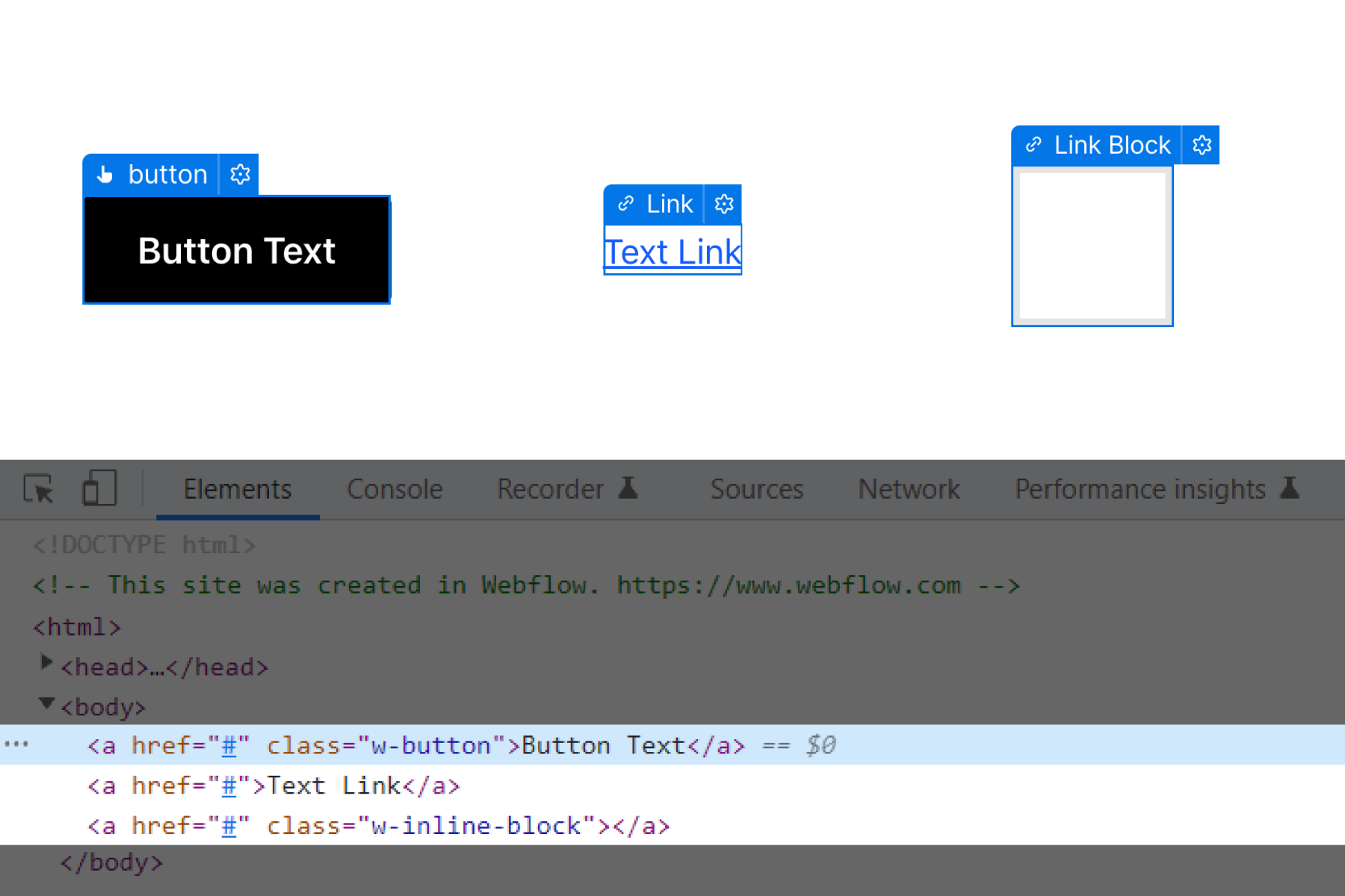
Unfortunately, using the <button> tag in Webflow is not possible to do as of the time of writing this guide (unless using an Embed component, which is not ideal).
When the use of a <button> tag is needed, we must use a <div> instead with the following conditions:
- It has a role=”button” attribute.
- It’s keyboard focusable with the tabindex attribute.
- [Finsweet solution coming soon] It fires a click event when the Enter or Space key is pressed.
- [Finsweet solution coming soon] If the button has pressed/not pressed states (like a toggle), it must have an aria-pressed attribute reflecting the current state.
- [Finsweet solution coming soon] If the button controls the expansion/collapse of another element (like an accordion), it must have an aria-expanded attribute reflecting the current state.
Creating HTML Tables in Webflow
The <table> element is not available to be used natively in Webflow.
We can still build accessible tables using regular Divs (meaning that a screen reader will be able to read the content in the proper order, following rows and columns) using the ARIA roles defined for this purpose. This is shown in this guide in the ARIA Roles: role=”table” section.
Hiding elements on the page
Aside from the most famous display: none style, that hides the element from the structure of our page, there are some times where we want an element to only be visible to a part of the user base.
Hiding elements from screen readers only
While parsing the content of our page, a screen reader will read out loud as much information as it can to describe it to the user.
There are some elements though that do not have any information attached to them, such as visual elements like styled divs or svg elements.
In those cases we want the screen readers to just skip them so they don’t break the reading flow.
This can be achieved by using the aria-hidden attribute. More on this in the ARIA section below.
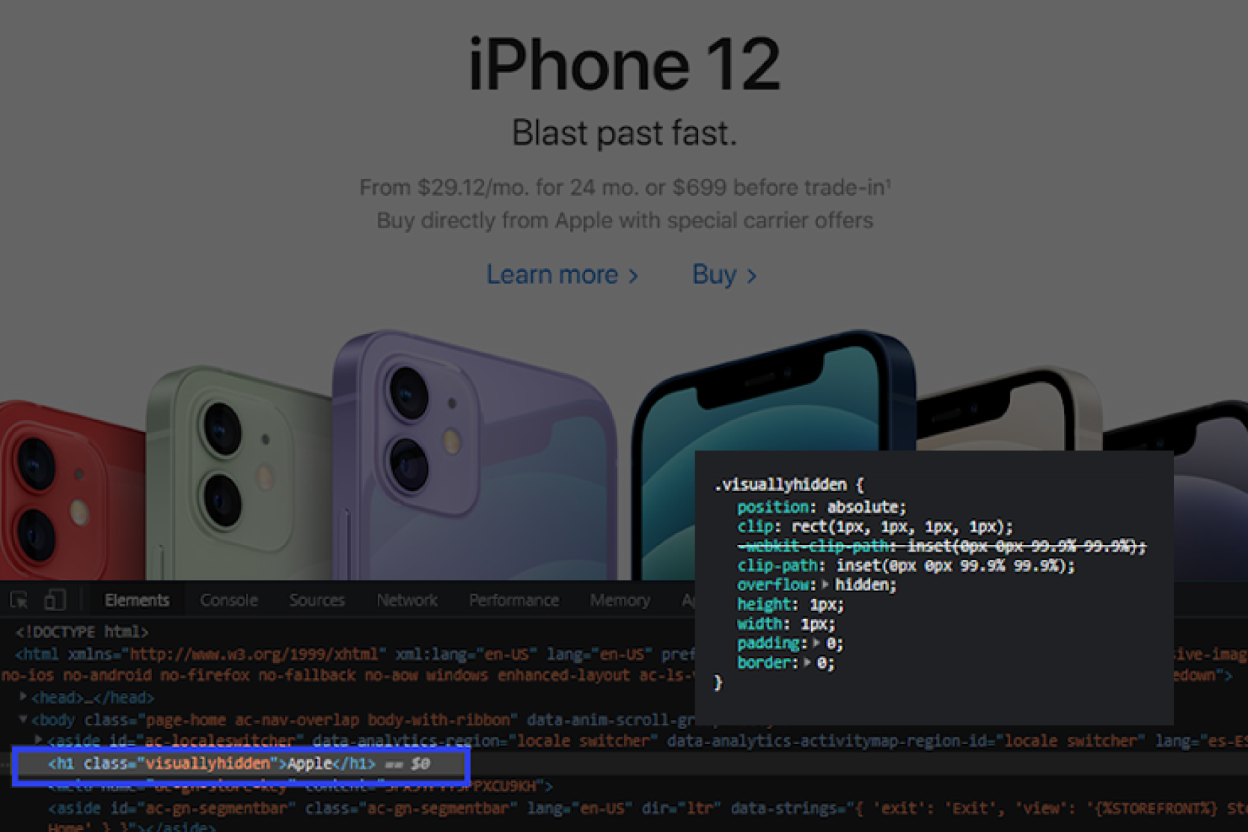
Hiding elements for regular users only
On the other hand, there are some times where we are using a visual representation of some content (like a fancy svg as the title of our page), but still want to provide context of it to screen readers (and crawling bots!).
We can achieve this by using CSS to visually hiding the content in a way that it will still be picked by screen readers and crawling bots:
.fs-a11y_visually-hidden {
position: absolute;
clip: rect(1px, 1px, 1px, 1px);
clip-path: inset(0px 0px 99.9% 99.9%);
overflow: hidden;
height: 1px;
width: 1px;
padding: 0;
border: 0;
}
This technique is used by many big sites like Apple!
ARIA
The MDN Web Docs describe ARIA as:
“Accessible Rich Internet Applications (ARIA) is a set of attributes that define ways to make web content and web applications (especially those developed with JavaScript) more accessible to people with disabilities.”
When building static sites with no interactivity, usually sticking to just using correct HTML semantics is almost enough.
But when adding custom functionalities using Javascript (Webflow Interactions count as it!), we need to provide more context to the users with disabilities so they can correctly read and use our site.
Note: Webflow’s native components like Navbar, Slider, Tabs, etc already use the correct aria attributes with the required Javascript for the dynamic ones.
ARIA Roles
Elements that provide a specific functionality to the page (thus they perform a role) must be defined so screen readers can understand the context of the actions / situations.
When using basic HTML semantic elements (like <button>, <nav>, <a>, <input>, etc…), these role attributes are not needed, as both the browser and the screen reader devices already understand their purpose.
We won’t list all of the available roles. Below are the most commonly used ones. We can check the full list on MDN Docs.
role=”button”
Used to define an element that doesn’t have a <button> tag that is acting like it.
role=”listbox”
Used to define an element that contains a list of options to choose from.
role=”option”
Used to define an element that represents an option in a list of options. Usually combined with the aria-selected attribute.
role=”table”, role=”rowgroup”, role=”rowheader”, role=”row”, role=”columnheader”
Used to define an HTML Table structure, where:
- role=”table” corresponds to the <table> element.
- role=”rowgroup” corresponds to the <tbody> element.
- role=”rowheader” corresponds to the <thead> element.
- role=”row” corresponds to the <tr> element.
- role=”columnheader” corresponds to the <th> element.
ARIA Attributes
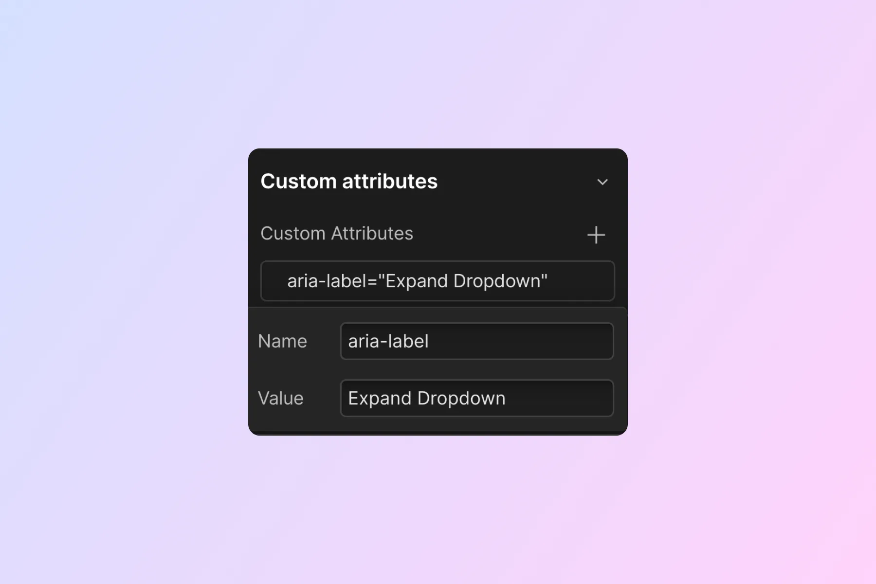
aria-label
How an element is announced by a screen reader is usually determined by its content
For example, a text-link like this:
<a href="https://www.webflow.com">Go to Webflow!</a>
Will be read out loud as “Go to Webflow!”. But there are some times where the content doesn’t explain the action that will be performed, or maybe there isn’t any content at all.
In those cases, using aria-label will let us give more context to the user.
Example:
aria-labelledby
aria-labelledby, as the name already says, lets us give more context to an element by pointing to another element that explains it.
The attribute is used like:
Where the element with an ID of “button-id” has some content in it that provides context to the user.
aria-describedby
In addition to an element's label, screen readers can announce a referenced element as its description, so the user can understand the context more deeply.
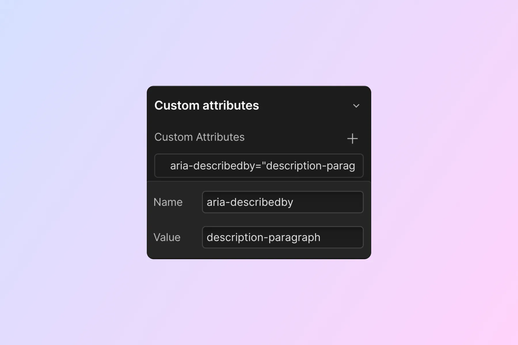
Where “description-paragraph” is the ID of the element that holds the description of the context.
aria-controls
This attribute creates a cause and effect relationship. It identifies the element(s) that are controlled by the current element.
Example: a button that opens a modal when clicking on it should have:
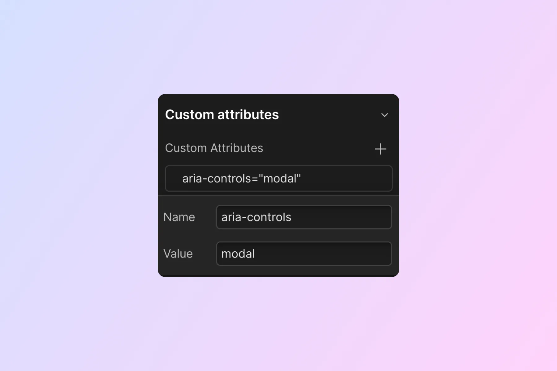
Where “modal” is the ID of the modal element.
aria-expanded
[Finsweet solution coming soon]
There are many situations where a user needs to be able to toggle an element’s visibility, such as when opening a hamburger menu or a modal dialog.
Usually, when an element becomes visible on the page, the user spots it right away. This is not the case for blind people, who need their screen reader devices to notify them about these changes.
This is where aria-expanded comes into place, allowing us to define the status of the element that is being controlled.
This attribute should be paired with the aria-controls one to provide the full context of the action to the user.
The value is set to true/false using Javascript depending on the element’s state:
aria-expanded=”true”
aria-haspopup
Complimentary to the aria-expanded attribute, we can further define what has been expanded with this attribute. It accepts the following values:
- aria-haspopup=”menu”, indicates the popup is a menu.
- aria-haspopup=”listbox”, indicates the popup is a listbox.
- aria-haspopup=”tree”, indicates the popup is a tree.
- aria-haspopup=”grid”, indicates the popup is a grid.
- aria-haspopup=”dialog”, indicates the popup is a dialog.
aria-pressed
[Finsweet solution coming soon]
Some elements require a visual confirmation that have been pressed, like a custom Switch being toggled on/off. Screen readers can be notified about this newly achieved state with the aria-pressed attribute.
The value is set to true/false using Javascript depending on the element’s state:
aria-expanded=”true”
aria-current
[Finsweet solution coming soon]
Used to identify the “current” item in a set of items. This has different applications:
- Page: used as aria-current=”page”, defines an element that has the current URL where the user is located. Usually set to the links that point to the current page.
Important: Webflow’s Current state in the Designer only adds a w--current CSS class to the element, but not the aria-current attribute. - Location: used as aria-current=”location”, defines an element that has the current page description where the user is located. A good example where to use this attribute is in a Breadcrumbs component, where the element describing the current page would get it.
- Date: used as aria-current=”date”, defines an element that has the current date. Commonly used in calendars and date pickers.
- Step: used as aria-current=”step”, defines an element that is indicating the current step in a multi-step process (like a multi-step form).
aria-selected
[Finsweet solution coming soon]
When building custom selection interfaces (like a custom dropdown of options or a combo box), we need to notify to screen readers what element is the one selected at any moment.
This attribute must be set dynamically, pointing to the element in the list that is currently selected:
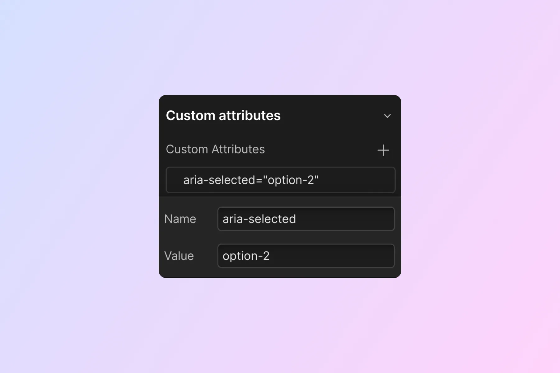
Where “option-2” is the ID of the selected element.
aria-hidden
[Finsweet solution coming soon]
As seen in hiding elements only from screen readers, sometimes a visual element provides no context to the user when reading it with a screen reader.
Setting the attribute aria-hidden=”true” will make them skip this element from being read out loud.
Commonly used components
Building accordions in Webflow
Trigger:
- [Finsweet solution coming soon] USWDS uses <button> tags, we will have to rely on divs with the role=”button” and use JS to trigger a click event on Enter or Space key.
- If using a div , it needs to have tabindex to make it keyboard navigable. It should also have its focus state styled.
- Use aria-controls for defining the collapsible content.
- [Finsweet solution coming soon] Use aria-expanded for defining the state of the collapsible content.
Content:
- Should not be hidden by default. Rely on JS to hide it when the page loads (this can be done with ix2) to make sure people with disabled JS can see it.
- Use aria-labelledby to define the trigger of it.
Other cool stuff we’ve found:
- When there are more than one accordion, using the Arrow keys should move the focus between triggers, using the Home key should focus the first accordion and using the End key should focus the last accordion. Check it out here: https://www.w3.org/TR/wai-aria-practices-1.1/examples/accordion/accordion.html
Bad practices for accessibility
Not using HTML semantic elements when available
There are some cases (like the <button> elements) where we are forced to find a workaround due to Webflow not providing them natively.
But there are other cases where using a role approach doesn’t make sense.
For example: links
Doing this:
<a href="https://www.google.com">Go to Google</a>
Is obviously preferred over this:
<div role="link" onclick= "window.location.replace ('https://www.google.com')">Go to Google</div>
Although the regular users will notice no difference at all, disabled users will not be able to navigate to the element and activate it with the keyboard, as well as other issues like SEO indexing of the link.
It might seem obvious with this example, but there are other use cases where something like this could happen.
Adding redundant WAI-ARIA attributes
Semantic elements (a, form, nav, etc…) will already be read by the screen readers. Adding to them an additional role attribute will cause the screen reader to read it twice, which can get very annoying.
For example: forms
The following element will be read as “Form, Form”:
<form role="form"></form>
Accessibility cloneable
We have created a cloneable to help us get started with accessibility inside Webflow. The Accessible Form Filter Components offers cloneable Filter UI components that are accessible. Each example has an in-depth explanation about how to make the component accessible.
Access the accessibility cloneable here.
Thanks! That's all for now!
We are actively working on our Attributes platform that will give us the power to implement everything in this guide.
Stay updated with Finsweet content to stay updated with our a11y updates.